One turnaround, one truth

Plug is an operational plugin displaying all the processes involved in the preparation of an aircraft for its next flight.


Timeline
2019 - 4 weeks

Client
KLM

Tools
Sketch, Invision, Jira, Confluence


Team
Product Owner, 2 Business Analysts, Information Analyst, UX researcher, 3 Developers, tester

My role
Interaction design, UI design, Usability testing, Documentation


Challenge

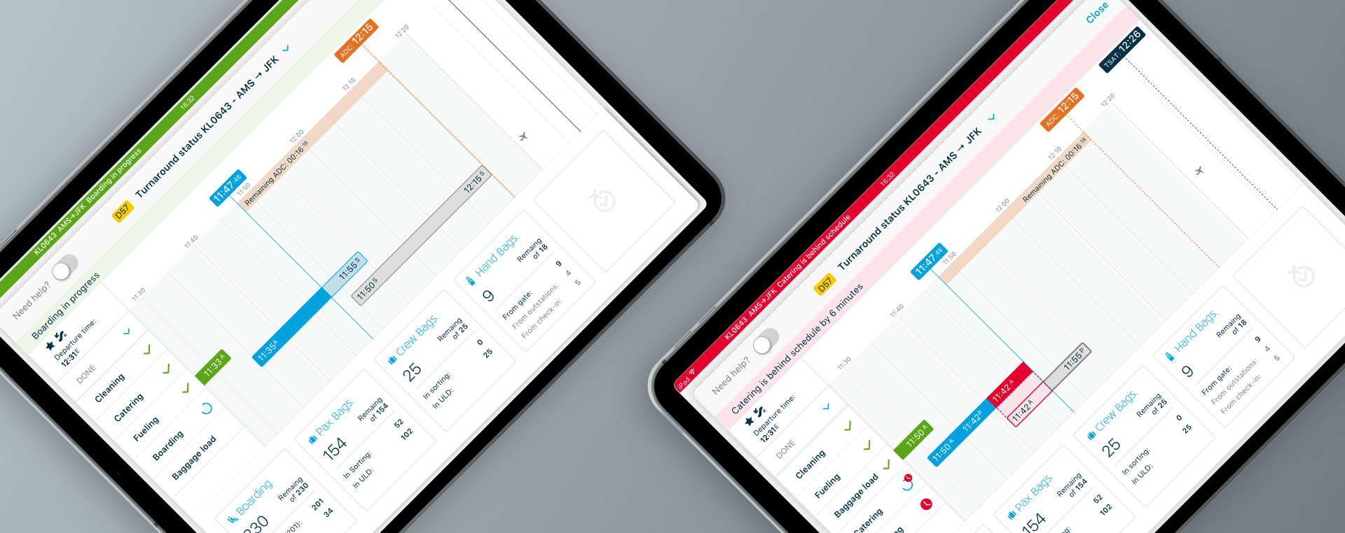
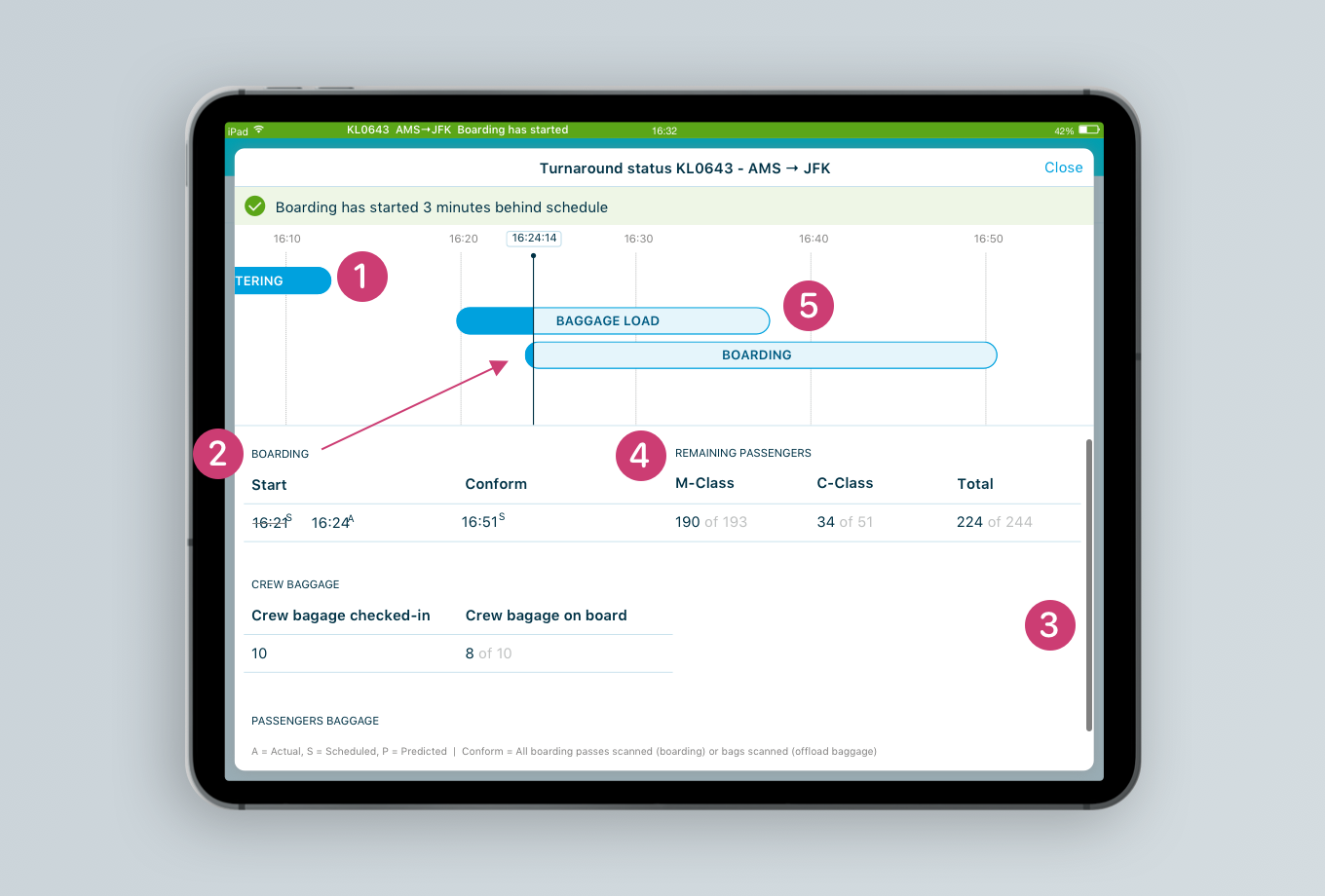
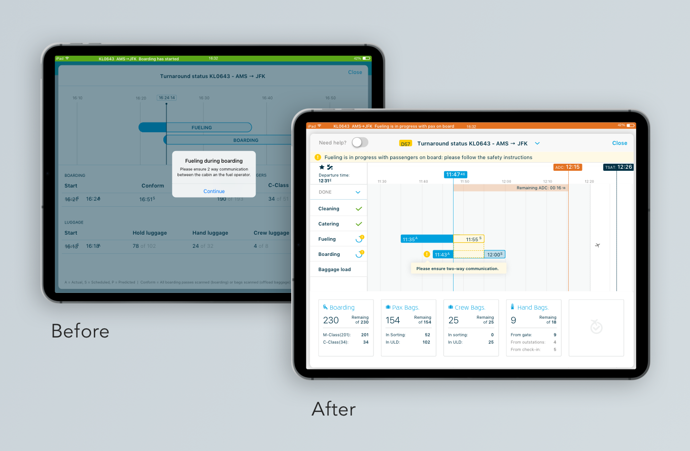
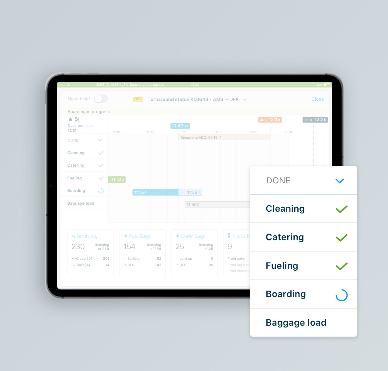
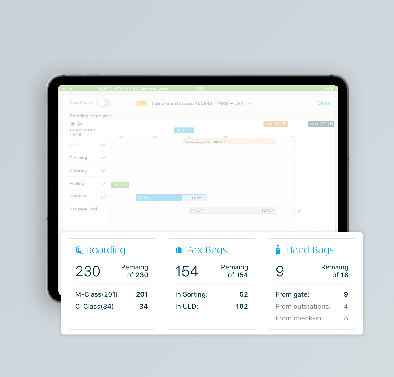
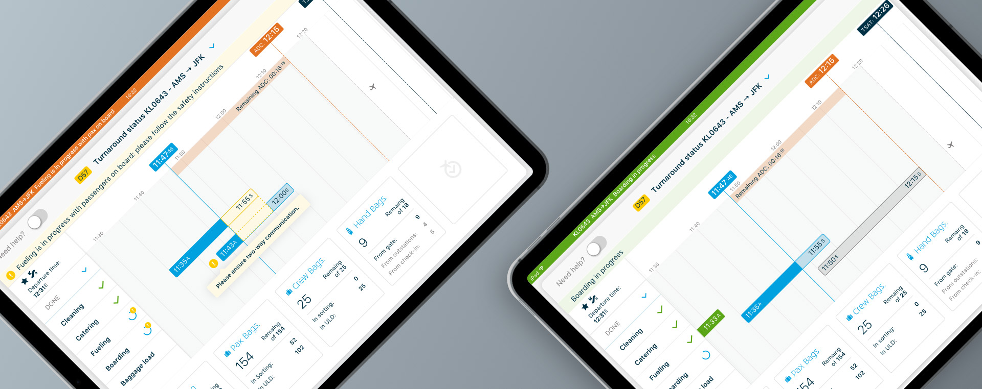
Plug is an iOs app displaying data on the aircraft preparation for KLM staff.
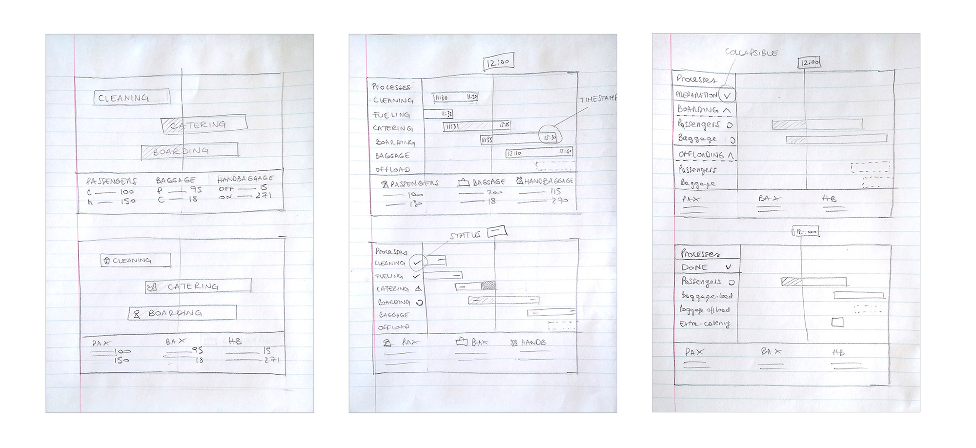
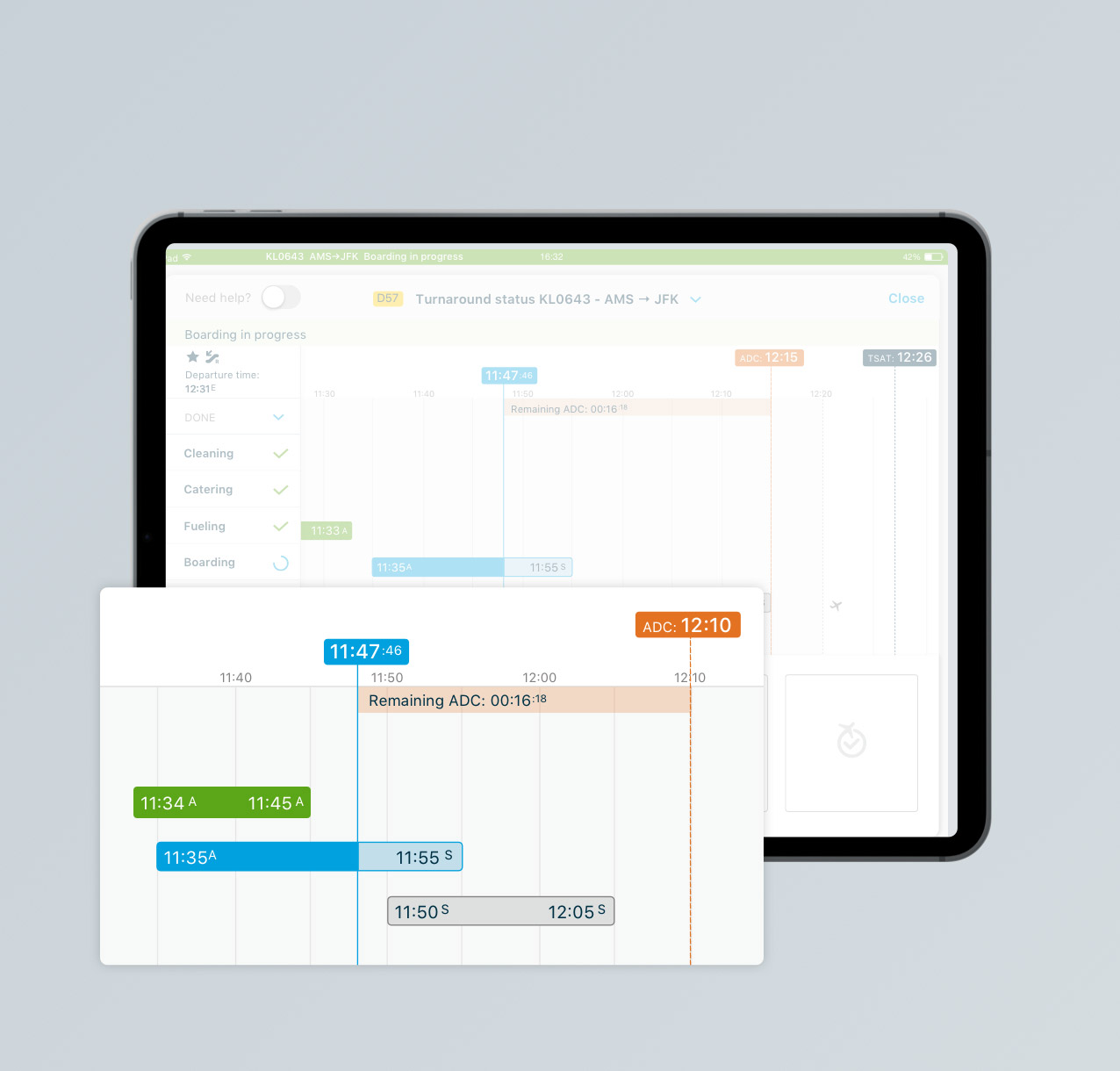
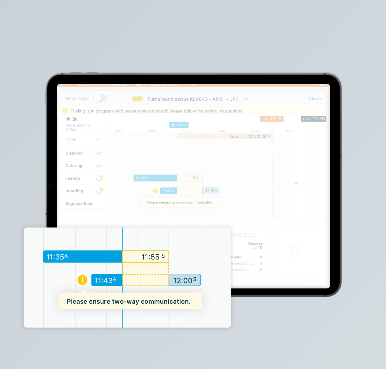
It contains a timeline with all the processes (cleaning, catering, boarding, etc...), their status in real time and information on the passengers and baggage.

The product owner asked me to redesign it, in order to display a larger amount of data and have a clearer and more professional look.
A user researcher took charge the preliminary research, while I redesigned the app and conducted the usability testing.


How might we better visualize the preparation processes of KLM aircraft at Schiphol airport?


Business goals & requirements
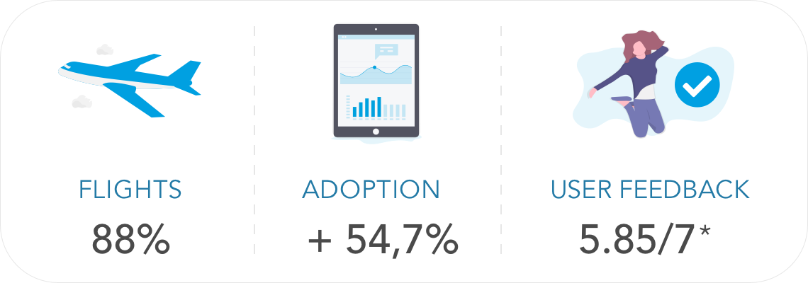
  • Increase adoption
  • Display more data
  • Have a clearer interface than the previous one
  • Fostering on-time performance
  • Reminding security & safety rulings

  • Technical constraints

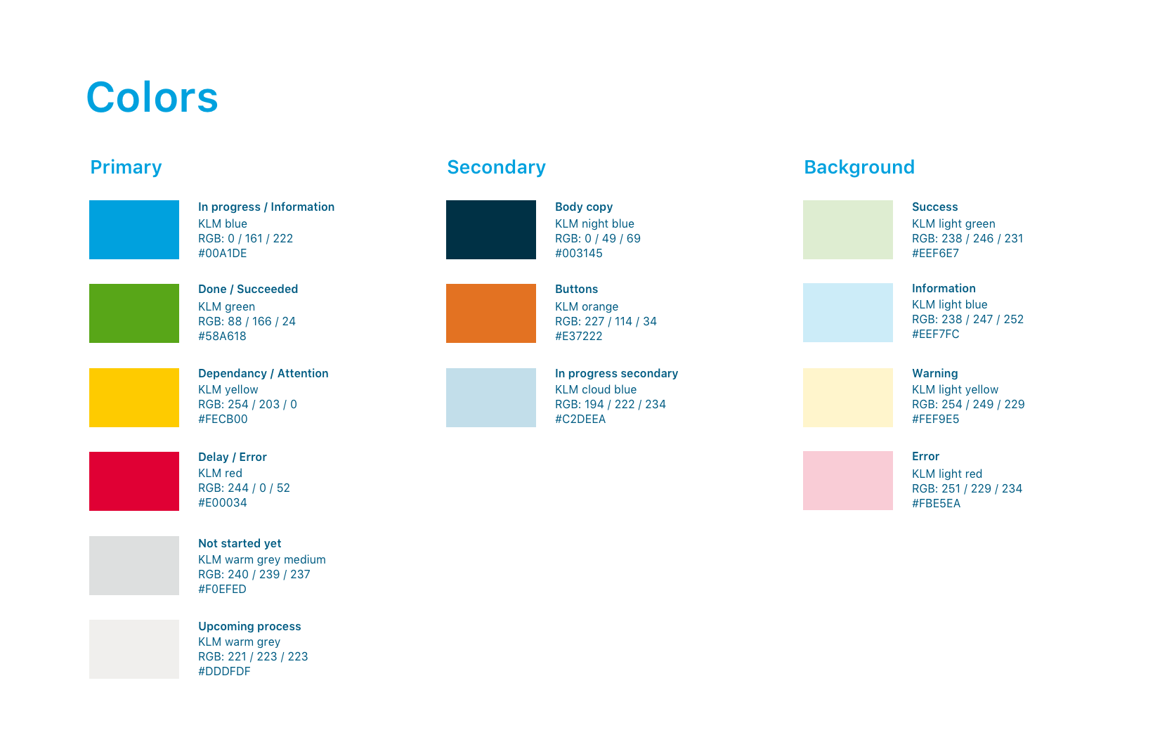
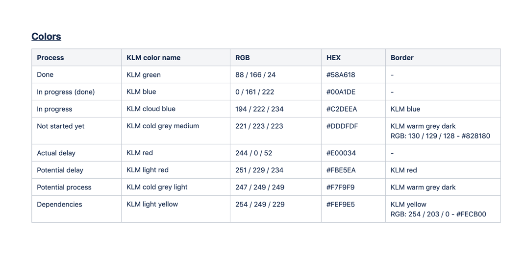
    • Display the exact same information to all the users
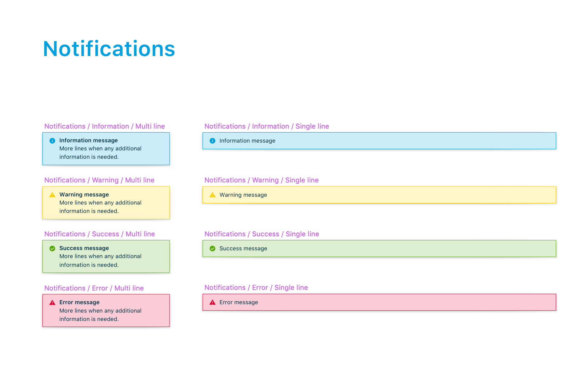
    • Have simultaneous notifications
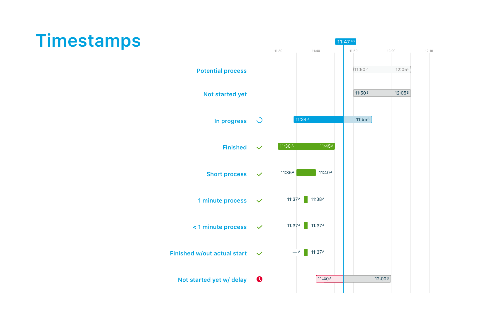
    • Show multiple interdependancies between the processes
    • iPad-mini limited size & unavailable vertical scroll


    • Analysis

      Previous design


      Problems identified

      1. The process name is not always readable
      2. It's difficult to link the time stamps to the corresponding processe
      3. Scrolling is necessary to see all the information
      4. The titles of the sections are not hierarchically organized
      5. The rounded edges of the bars don't convey a feeling of professionalism


      Insights from the UX researcher

      The research conducted by my colleague highlighted that:
      • The process involves multiple teams with different goals
      • The staff needs to quickly see the processes and their status
      • The staff needs to see the interdependencies between processes
      • iPads are often at more than 50 cm from the user


      • Ideation

        Solutions

        To solve the problems highlighted by the research, I focused on specific areas:

        1. Sidebar

        🤔 Problem: for our employees it is crucial to see which tasks are in progress and upcoming, but with more data available, the number of processes had increased causing them to disappear from the main view.

        💡 Solution: I organised the processes in a collapsible sidebar where current and upcoming ones are visible, while the completed ones are hidden.


        Idea 2: dependancies

        🤔 Problem: the interdependencies may involve up to 3 processes and have various combinations.

        💡 Solution: together with the developers, we came up with the possibility of displaying the processes in a dynamic order.


        Idea 3: notifications

        🤔 Problem: on-time performance being a main KPI, employees need to access a maximum of information at a glance. Current notifications, displayed as alerts covering and blocking the screen were not optimal.

        💡 Solution: I integrated the notifications to the dashboard, to have them visible while not hiding any crucial information.


        Idea 4: accessibility

        🤔 Problem: the data is hard to read when iPads are not held in hand

        💡 Solution: I added icons for visibility and increased the font size.


        TOWARDS THE MVP

        Usability testing

        After testing the mid-fi prototypes with employees from 3 different work-areas, I transformed the sidebar into a checklist and added icons to grab users attention on the status of the processes.

        Defining the UI

        With the validated interface in mind, I defined the style guide according to the design system. For the processes statuses, I chose the iconic KLM blue and the notification colors (green, orange and red).


        Scroll/swipe left to see the images, click to zoom
        Colors
        Icons & processes
        Timestamps display
        Notifications
        Ideation
        Documentation


        Final product

        Plug can now display all the processes involved in the preparation of the aircraft.
        It shows real-time data and actionable information, to empower the employees in their decision-making.

        Features


        Process overview
        Displaying all processes as a collapsable checklist with a progress indication.

        Timeline
        Visualizing processes, statuses and dynamic timestamps


        Context view
        All figures collected are visible in one view and updated in real time

        Actionable information
        Displaying dependencies between processes and notifications


        Outcome

        After implementation, the app was used on 88% of the KLM flights and was perceived by our users as being much clearer than the previous design (mean of 5.85/7 on a strongly disagree/agree 7 point likert scale).


        Learnings

        The app being very complex and technical, I had a lot of refinements with the developers and the information analyst to discuss all the possible cases and exceptions and come up together with ideas and solutions.

        In order to make the developers understand all the different scenarios in my designs, I documented all the possible combinations of processes and statuses and the different kinds of dependencies and notifications.