My role
Scope, Concept development, User research, UX design, UI design, Animation
Goal
Being an expat myself, I know it takes time to meet new people and form friendships, but for introverts this can be particularly challenging.
So I decided to design an app to help people socialize within their comfort zone.
Main challenges
Help people feel comfortable while socializing
People have different personalities, expectations and difficulties
Create a better offer than the existent one
Don't be biased by my personal experience of expat
Research
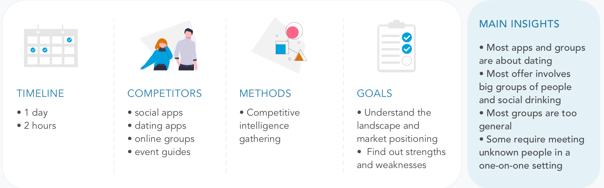
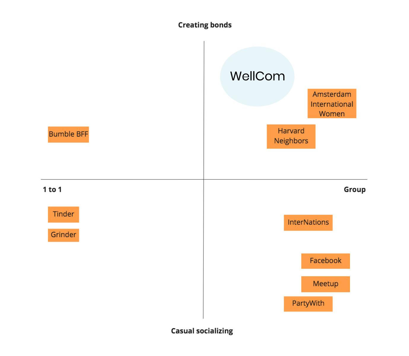
Competitive analysis
To understand the offer, I needed to check out the existing websites and apps.
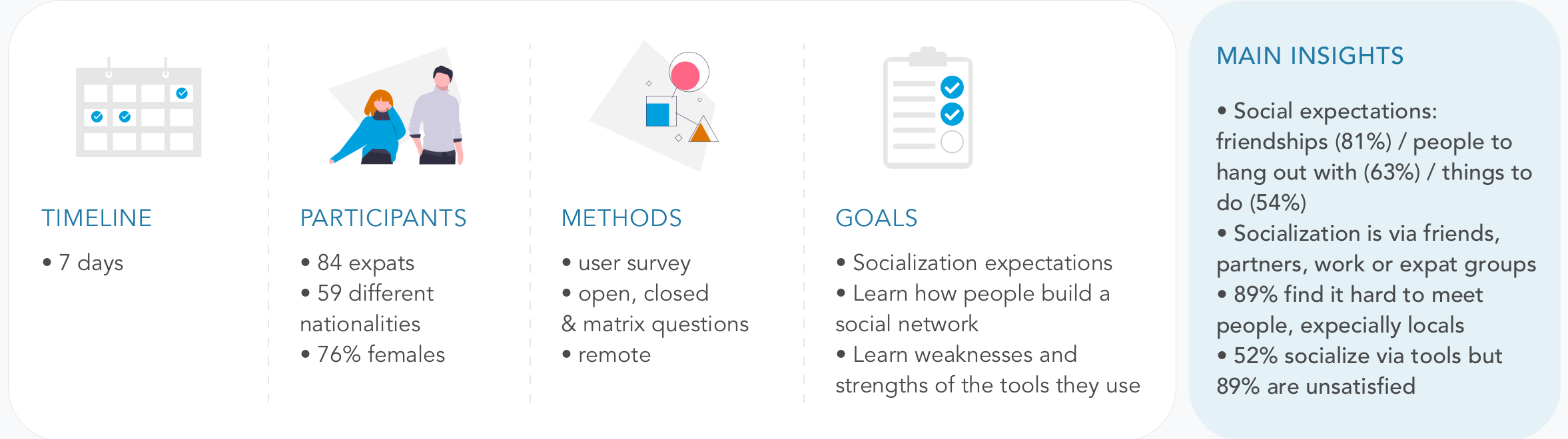
Survey
To gather quantitative data on expats' expectations and pain points while socializing, I created a survey.
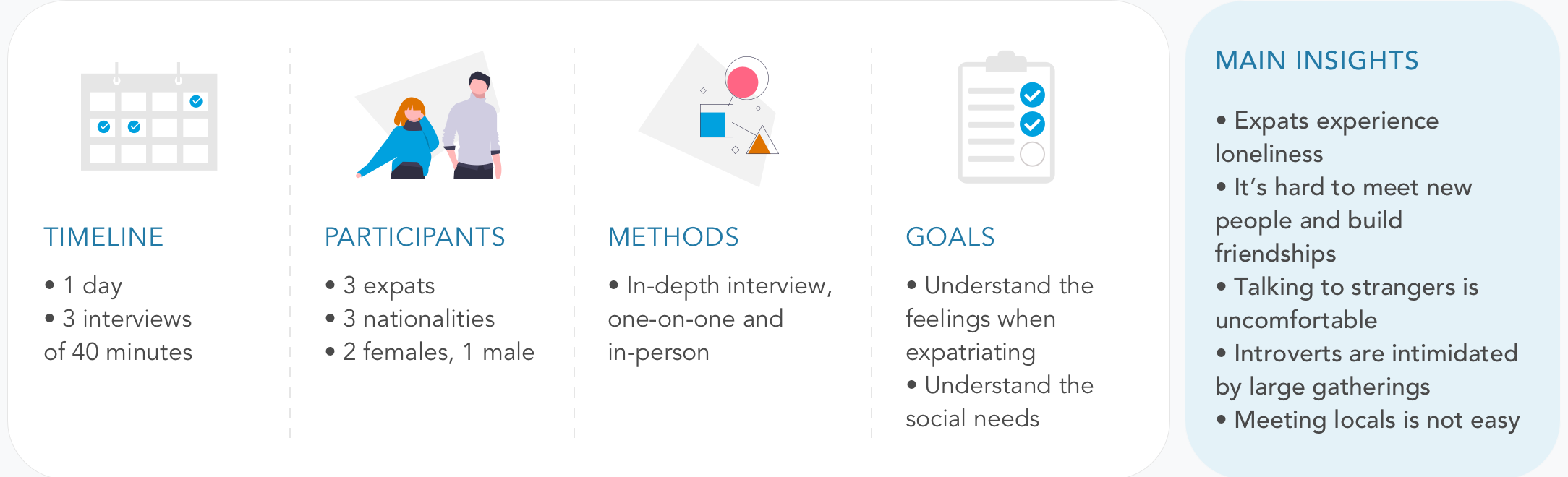
Interviews
To dig deeper into the data and understand the feelings of expats, I conducted
3 interviews.
“I’ve never had to make friends outside work or school.”
— One interviewee
Analysis
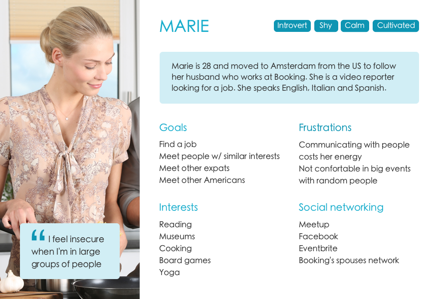
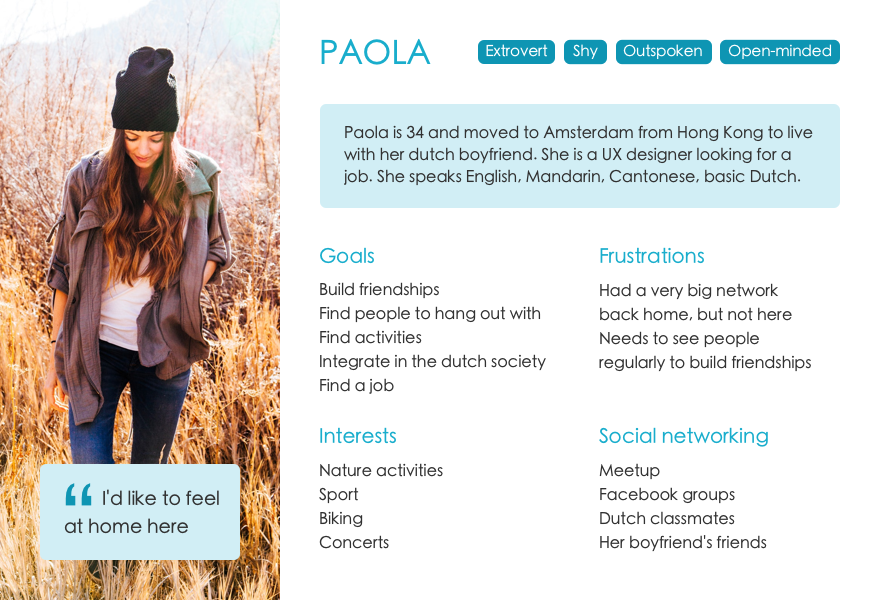
I structured the data to evaluate the strategic positioning of the product and segmented the target audience in two user personas, that gave me a clear picture of users expectations and frustrations. They also helped me
grounding my design decisions on facts, avoiding my personal assumptions of expat.
Scroll/swipe left to see the images, click to zoom
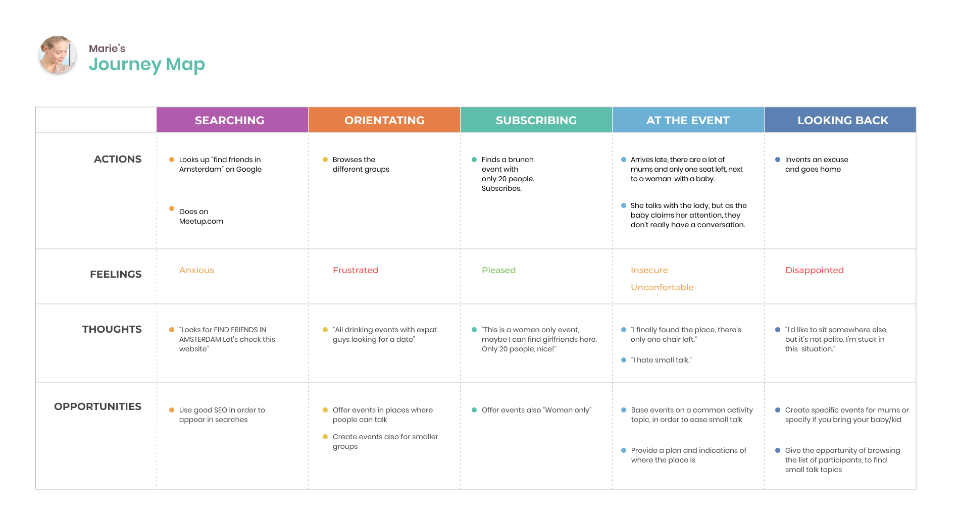
User journeyUser persona 1User persona 2Strategic positioningMoSCoW
Ideation & prototyping
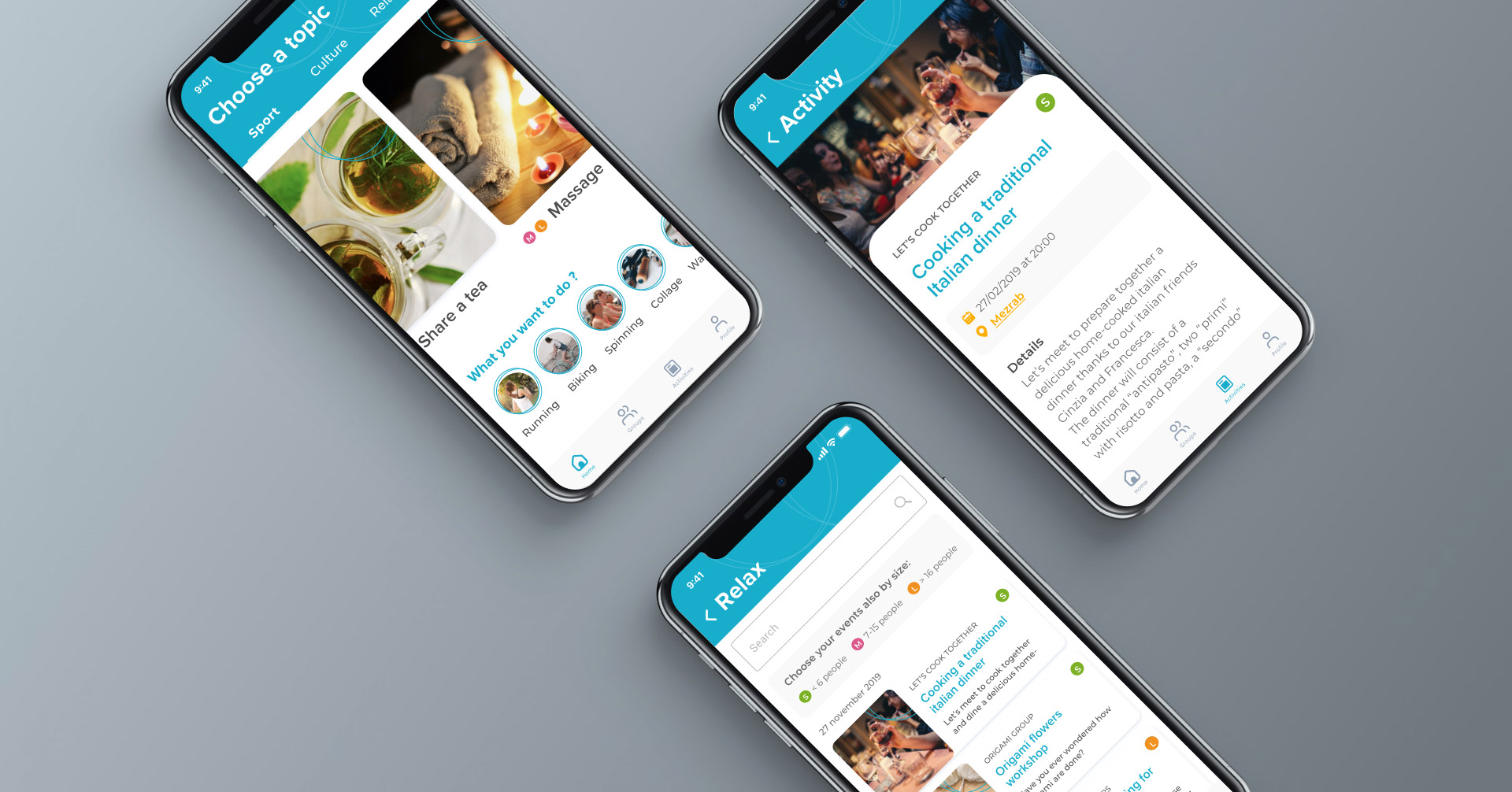
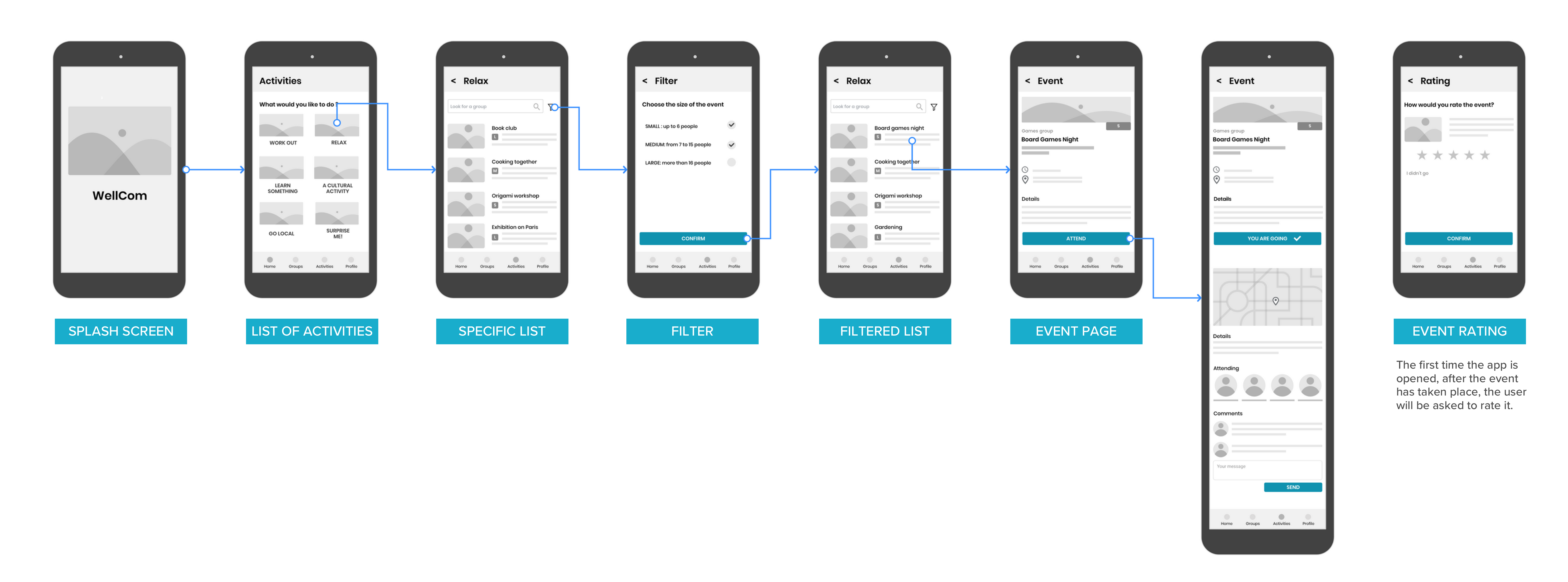
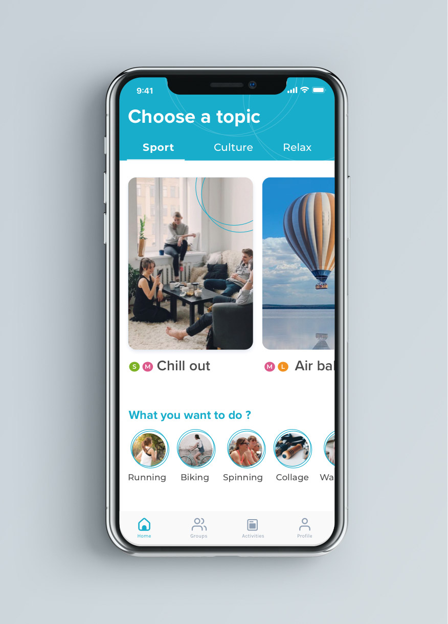
After exploring different ideas on paper, I came up with the idea of an app that helps people socializing while doing things together, featuring:
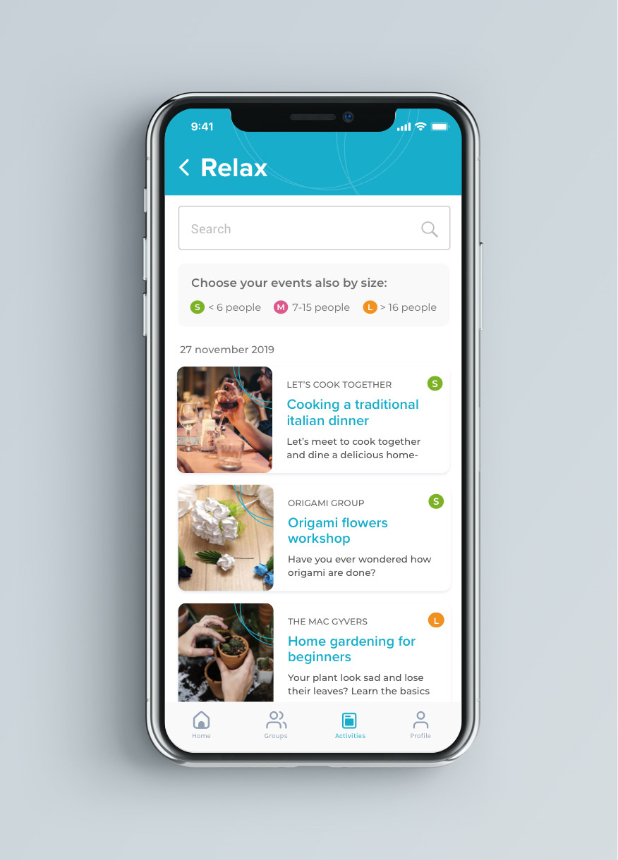
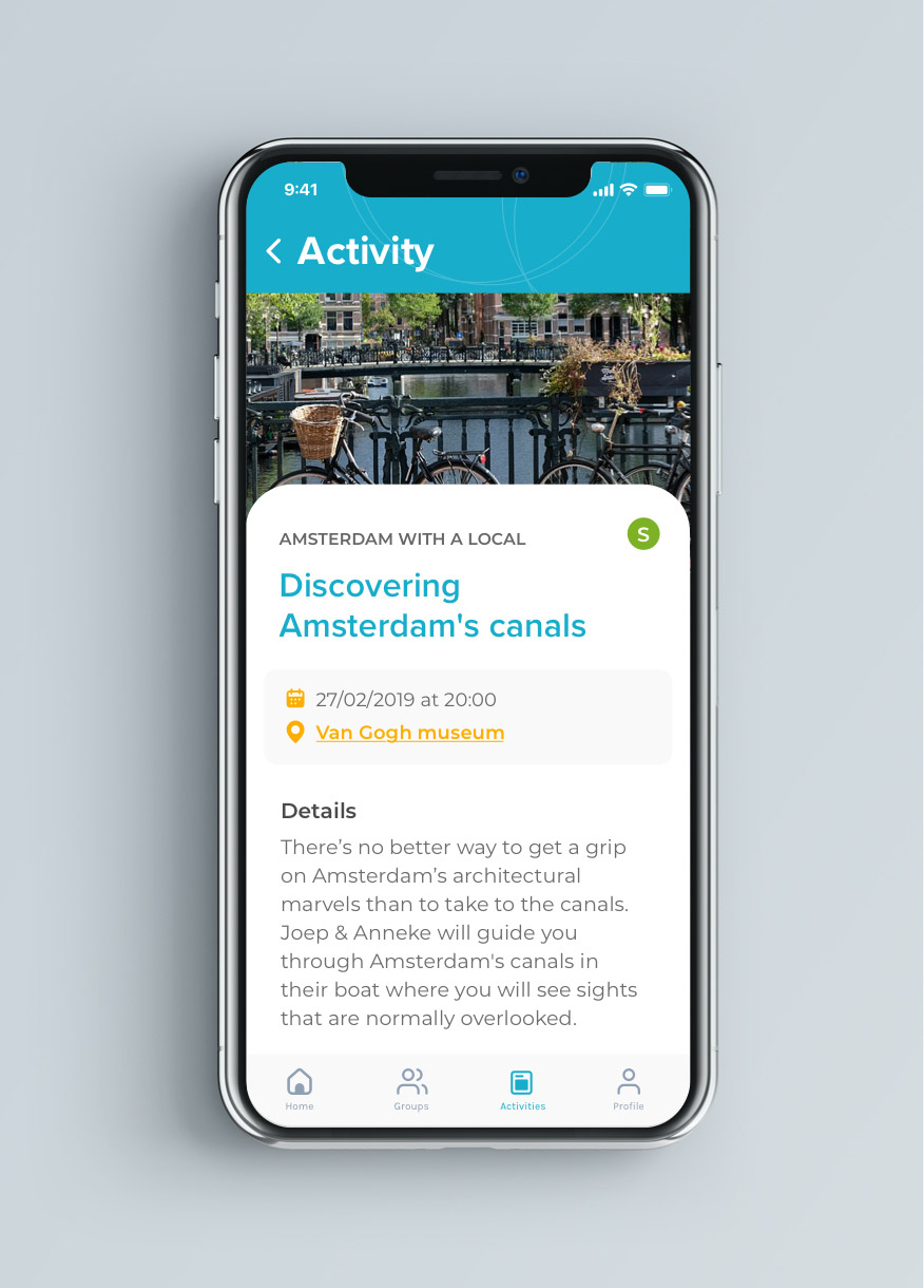
a list of local activities organized by type
a categorization by number of participants
the possibility to join small, medium or large groups
Wireflow
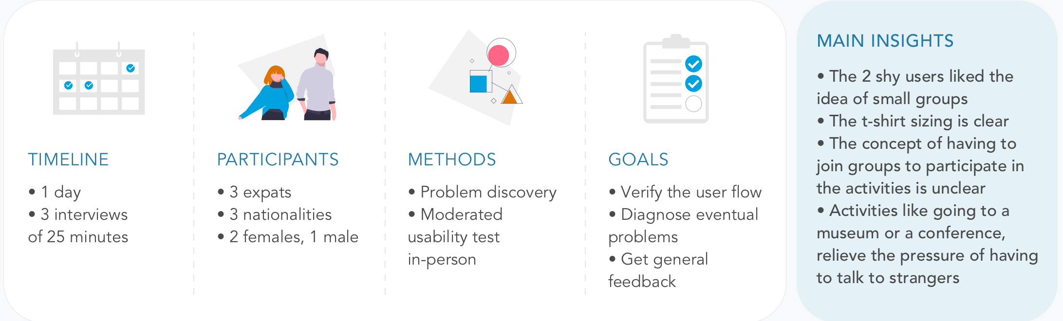
Usability testing
I gathered the same people I interviewed and I conducted a usability test.
Design
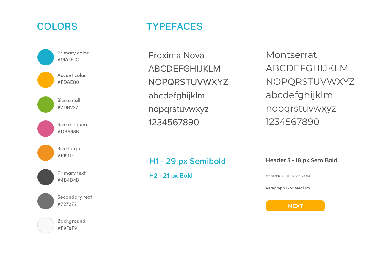
Iteration and UI definition
After simplifying the flow, by removing the step of joining a group to participate in the activities, I focused on creating a clean UI.
I chose a vibrant light blue as primary color and orange as the accent one.
Three other colors indicate the number of people participating in the activities.
Scroll/swipe left to see the images, click to zoom
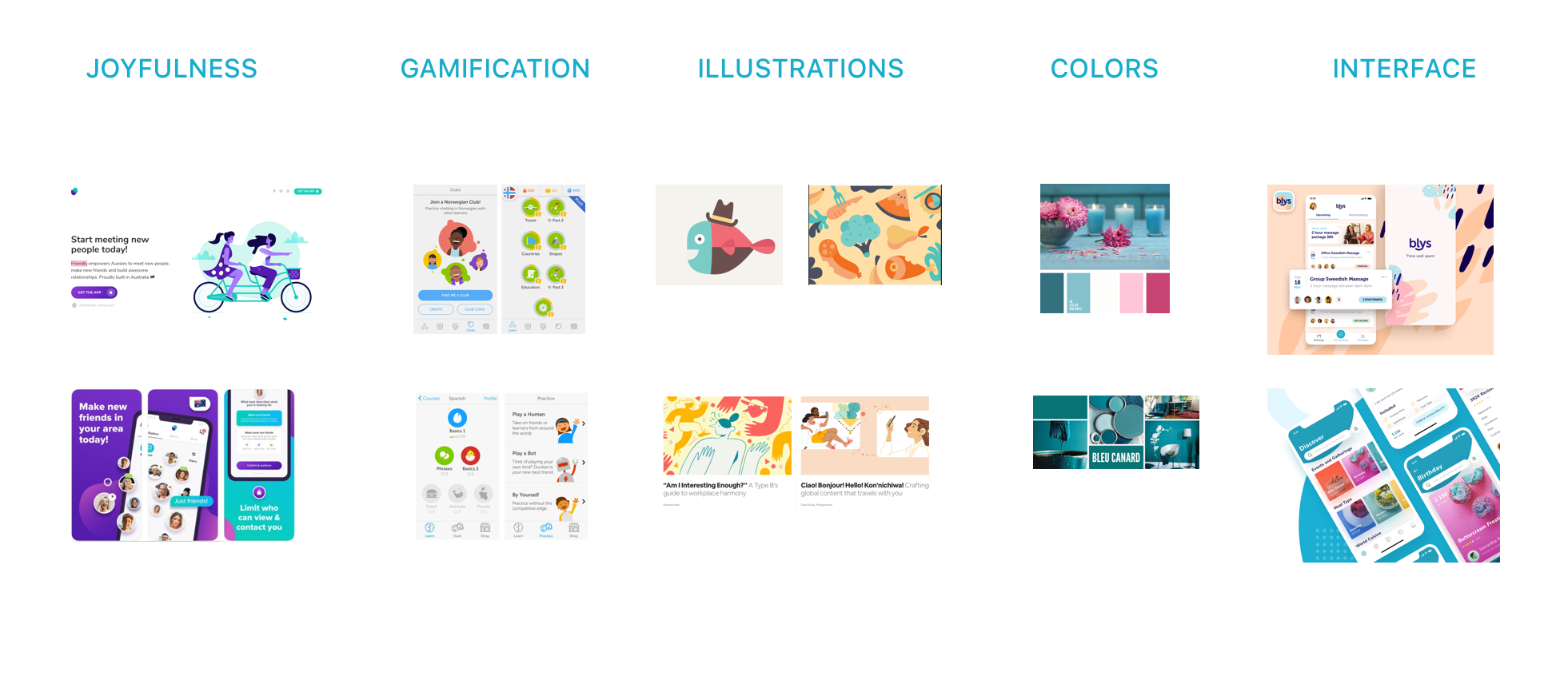
Style tileMoodboard
Features
Do what you love Meet new people while doing things that make you happy
Introverts welcome! Choose events based on the number
of people attending
Go local Meet locals while getting
to know your new city
Learnings & next steps
My initial idea of creating groups and having to join them to participate in the activities was too complicated and I had to simplify it.
The idea of T-shirt sized groups was well received and the possibility of small groups made people feel more confident and willing to participate in activities.
From a monetization point of view, the app could have paid referrals of restaurants, concerts halls, gyms, museums, schools and offer paid plans for individuals promoting their activities or for companies employing expats.